
West Health Institute — Healthcare Affordability Research
Senior UX Designer role translating dense policy research into communication tools for lawmakers, researchers, and students. Built on the West Health-Gallup Survey on Aging in America, a nationally representative study of 5,000+ U.S. adults.
The Challenge
The data was rigorous and the stakes were real. Over 80% of older adults live with at least one chronic condition. An estimated 72 million Americans skipped needed care in a single three-month window because they couldn't afford it. By 2030, seniors will make up 20% of the U.S. population. The research said all of this clearly. The problem was making it land for audiences who don't read 36-page policy reports.
What I Designed
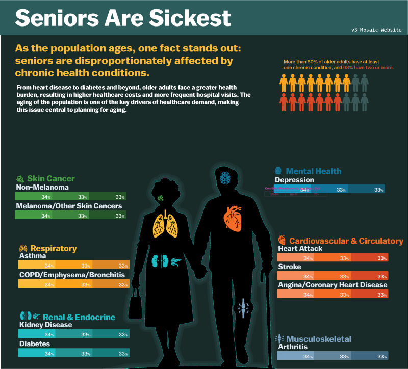
A suite of communication interfaces and data storytelling products that translated survey findings into tools people could actually read, absorb, and use. That meant decisions about hierarchy, visual weight, narrative entry points, and what to cut. The "Seniors Are Sickest" infographic organizes chronic condition burden by body system and age cohort, giving readers a spatial way into data that would otherwise require deep reading. Color does categorical work. The body silhouette grounds the statistics in something human. The layout lets readers navigate at their own pace rather than following a forced sequence.
Key Design Decisions
- Led end-to-end UX and front-end development across the full publication pipeline, from research output to finished web products
- Translated survey findings into visual hierarchies that served both general audiences and policy-focused readers
- Used progressive disclosure to let the data breathe without hiding the complexity underneath
- Coordinated across research, editorial, and product stakeholders at West Health and Gallup to keep outputs aligned with policy goals
- Integrated AI tools across data exploration, content workflows, and rapid iteration cycles to accelerate delivery
Design Principle
The numbers already tell the story. The designer's job is to make sure the reader doesn't have to work to find it.